Lucidworks Fusion styleguide
Client: lucidworks | My Role: UI / UX / Visual Designer
Problem:
When I came on board the UI team, the product was in its first phase. It just launched 1.0. The guts and glory were on the table and now it was time to build from there. At the time, the team didn't have a designer, thus putting me on the team to try and help fix some of the problems.
Solution:
At the time, there was no assets or styleguide. The team would make wireframes, build and then push to master. It was a process but wasn't the best organized route. When I started, I would get these wireframes and design from there. It was designing on a micro level rather than a granular, scalable approach.
I quickly realized we needed a styleguide. Not only visually, but in the front end so everyone would have requirements. We set rules that reflected my designs and plugged them into a code styleguide. For example, the team didn't need to type hex values, they would uses Saas to generate colors from the guide. This sped up building time not only for the team coding, but for me walking over to each desk describing pixel for pixel how a feature should look. It was fantastic.
The following examples are just bits and pieces of the guide, but the logic is their.
Styleguide 1.0
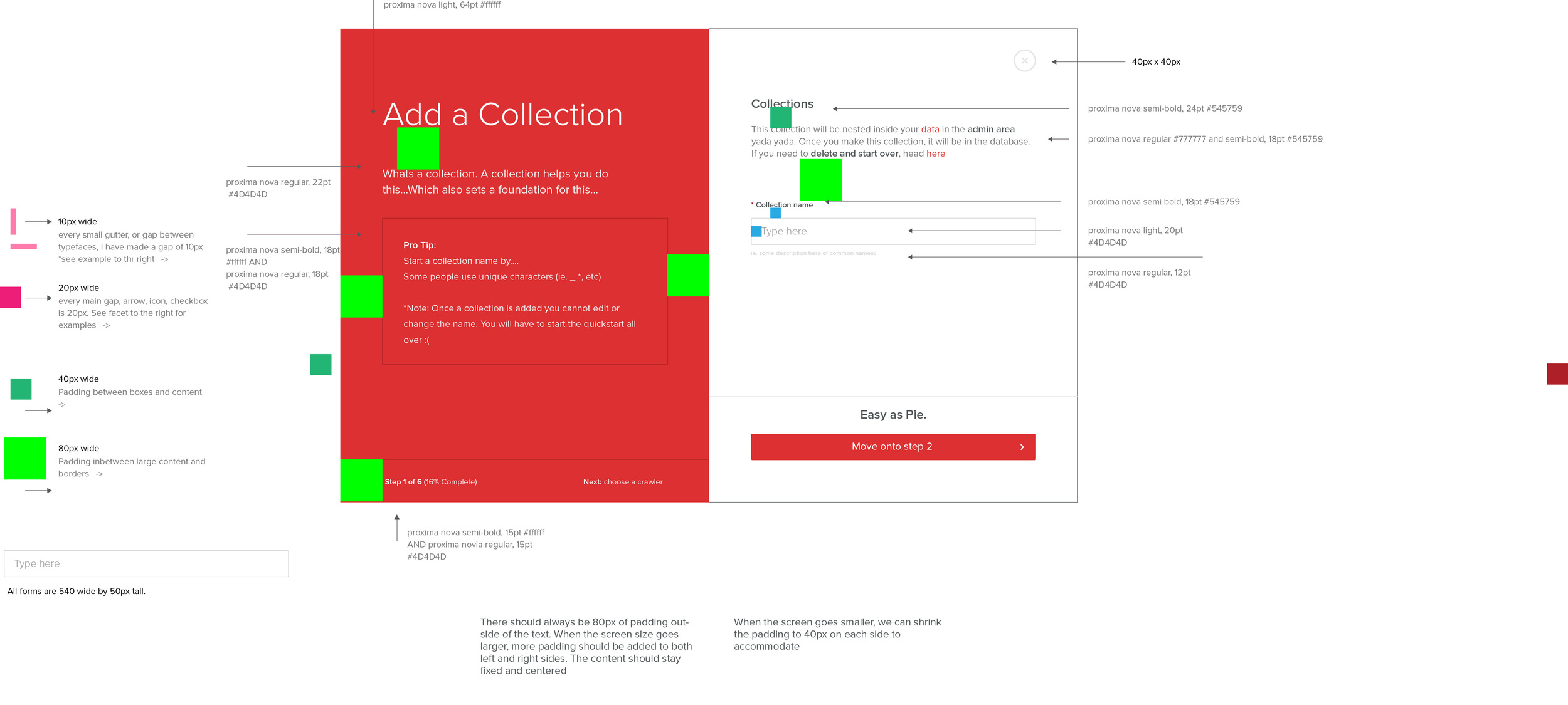
At the time, sketch wasn't around. I would design features in Illustrator and draw arrows with each property attached to it. This worked quite well and a great start.

Fusion 1.0. Making a styleguide per feature.
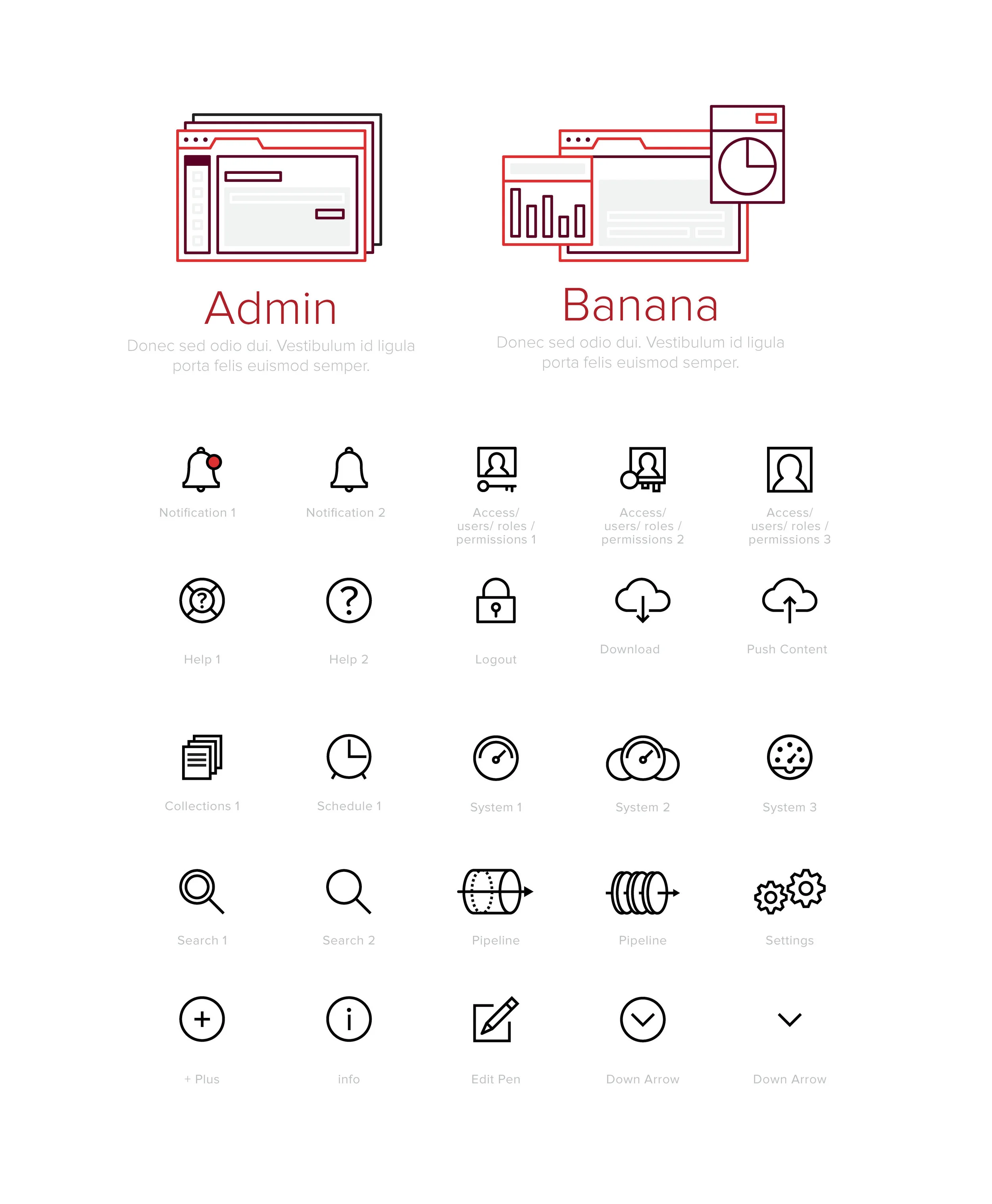
First iteration of icons in 1.0
Styleguide 2.0
This transition from 1.0 to 2.0 saw a lot of growth in our product. We were designing a complete overhaul of the UX / UI and needed a solid styleguide to get the team moving fast for building. This revamp took about 8 months from start to finish. The beauty of this 2.0 version set guidelines for typography, icons, padding / margin and overall workflow of how features should look. This iteration helped streamline production by using the programs Sketch and Zeplin.
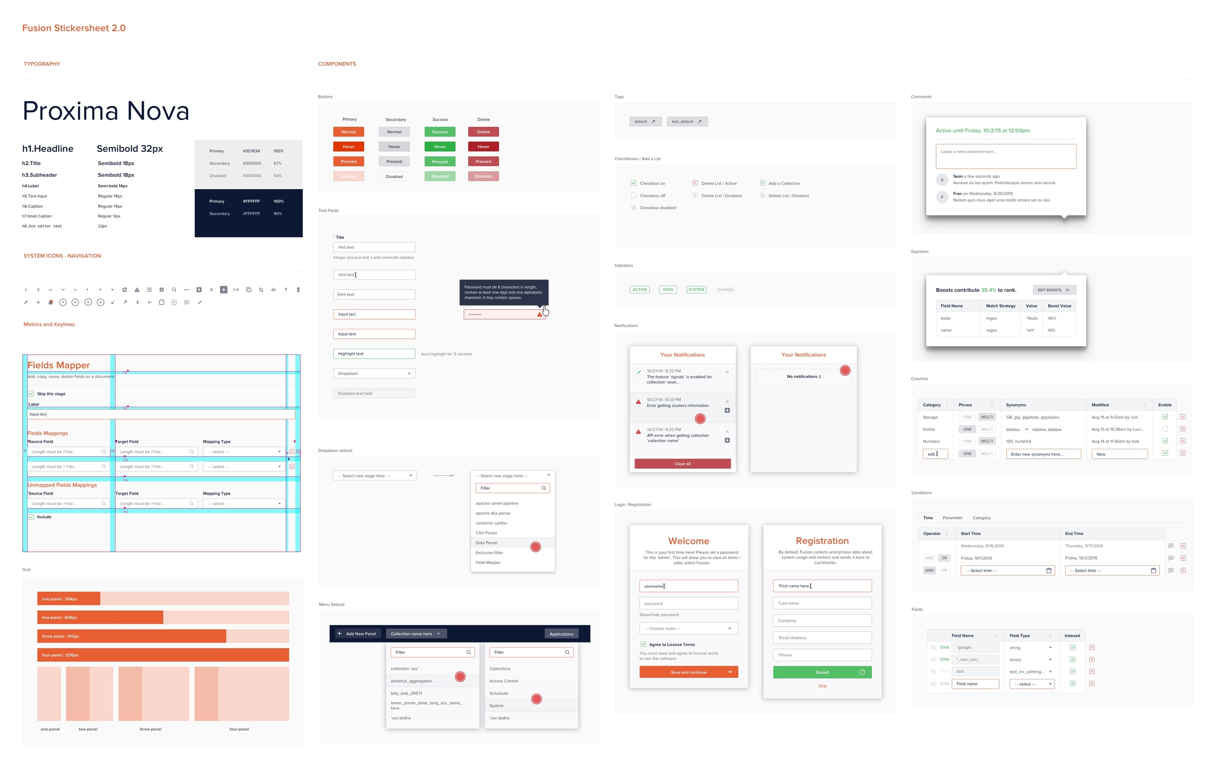
Styleguide 2.0
Styleguide 2.3
Diving deeper into the product some styling would need constant improvements and updating. Maybe our icons were too thin and needs thickening, or our button actions didn't work properly. For example, since our product was utilitarian driven, we quickly realized our typography was too large and didn't need to take up so much real estate. Fixing these product needs through customer complaints / trial and error helped define our product day by day.
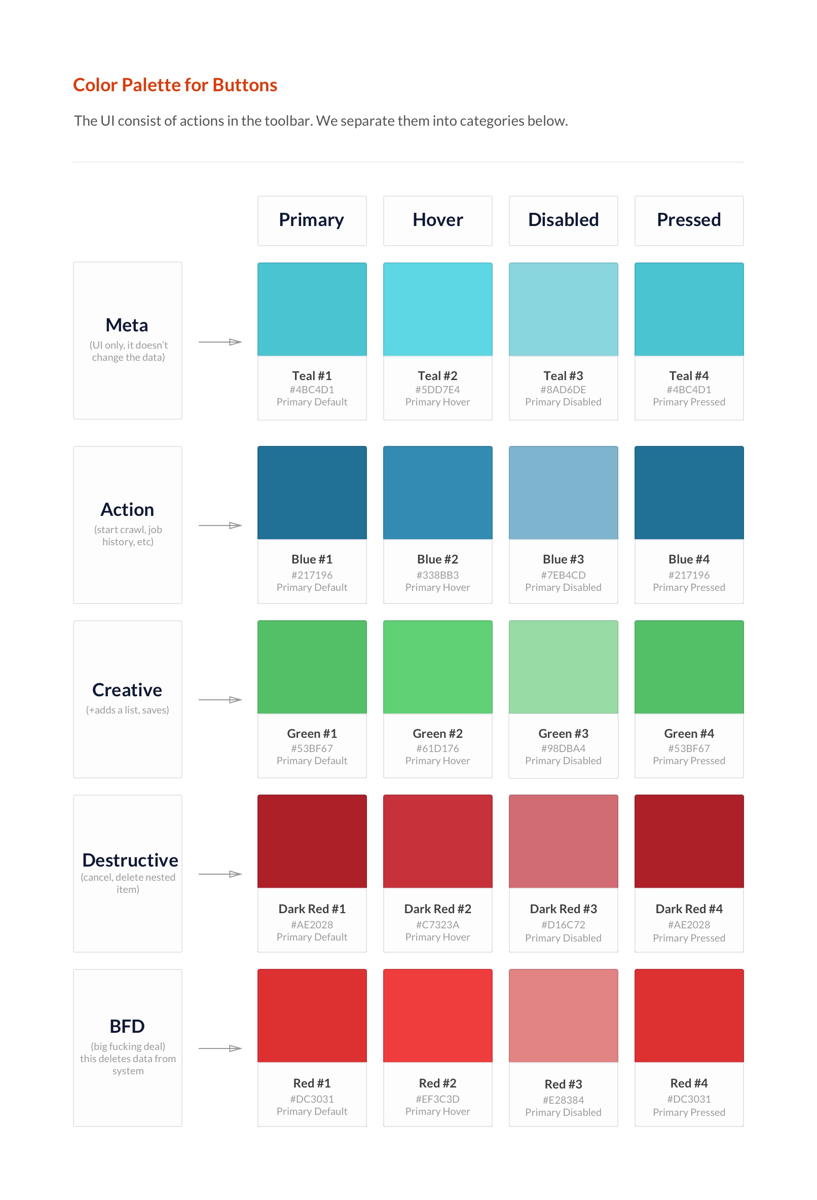
color palette getting more defined based on button actions and their hierarchy.

Typography needed a more define role. Some headings needed to pop more, while others are more subtle.

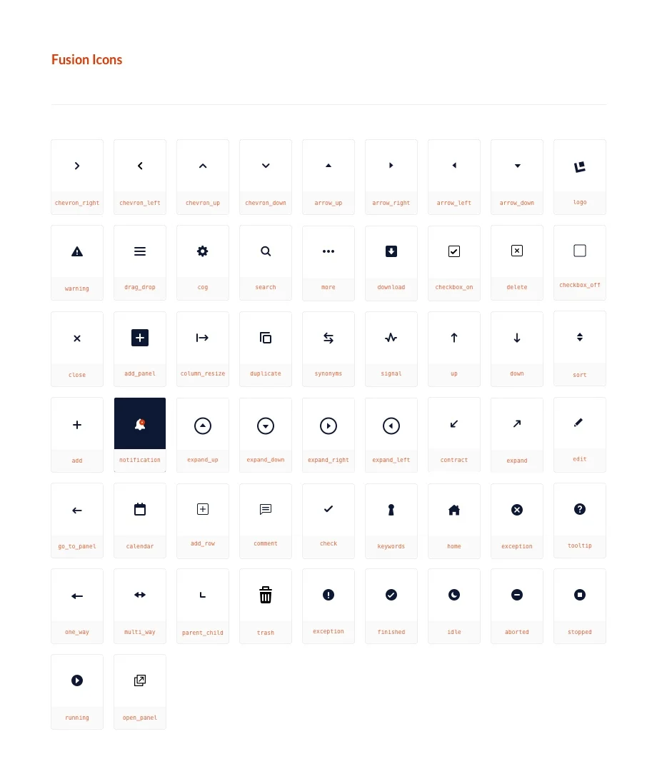
2.3 icons updated and labeled to use with our code styleguide.


2.3 panels expanded with a few quick notes for the team. No need to write property values like version 1.0. It's all in Zeplin now.